Several weeks ago, 4As, a leading trade association representing the advertising agency business unveiled the winners of its second annual 4A’s Partner Awards.1 The 4A’s Partner Awards recognize the creative excellence that can only be achieved through meaningful collaboration.1 This year’s awards honored partnerships across the following categories: brand, cause, creative, diversity, health & wellness, media, pro bono, technology, most innovative and partnership of the year.1 http://partnerawards.aaaa.org/2016-winners/
The Be An Idea team reviewed the winning case studies looking for useful lessons for clients. Upon closer inspection, the team found one campaign that stood out among the winners – “love has no labels,” this year’s recipient of the Partnership of the Year award. The campaign stood out because of how its partners creatively tackled a long-standing social issue.
“Love Has No Labels”
(Partners: Upworthy, Ad Council, R/GA, Anti-Defamation League, American Association of People with Disabilities, Southern Poverty Law Center, Muslim Advocates, National Women’s Law Center, American-Arab Anti-Discrimination Committee, Human Rights Campaign, American Association of Retired Persons)1,2
(Supporters: Coca-Cola, P&G, Allstate, State Farm, PepsiCo, Unilever)2
In 2015, a campaign called “Love Has No Labels” was launched in the United States to tackle implicit bias. The campaign explains that “while the vast majority of Americans consider themselves unprejudiced, many unintentionally make snap judgments about people based on what we see — whether it’s race, age, gender, religion, sexuality or disability.”3 They call this subconscious prejudice implicit bias.
The campaign’s centerpiece was a three-minute video of a giant X-ray screen set up in Santa Monica, California, on Valentine’s Day. Real people of different genders, abilities and sexual orientations embraced, danced and kissed one another behind the screen.1 At first viewers aren’t quite sure what is going on because all they see are two or three skeletons. Then the people step out from behind the screen to reveal themselves. For instance, the two skeletons kissing behind the screen were two women and the three skeletons dancing were two fathers and their young son. The X-ray screen was designed to catch viewers off guard, and make them aware of how they make snap judgments about others without even realizing it.4
Case study video:
What The Campaign Did Well:
1. Made people aware of their own implicit bias
The challenge with implicit bias is that it’s locked away in the subconscious mind, thus not apparent to most. Simply educating people about the prevalence of implicit bias would never work as it could have been too easily brushed off. People need to witness implicit bias for themselves.
The X-ray screen stunt jolted viewers and made them aware of their instinctive first reactions. It was this powerful epiphany that sparked conversation on tackling implicit bias.
Alerting people of their implicit bias is a powerful technique that can be used in other cause campaigns. In fact, it’s already widely used! Two great examples include: Always’ “Like a girl”5 and Coca-Cola’s “America the Beautiful.”6
2. Promoted understanding for the cause by leveraging the expertise of partners
The campaign drove millions to a website where they could find more information on implicit bias. The site featured a test developed by Harvard University to help identify hidden biases, then provided explanation on why their answers showed bias.2
Non-profit partners also helped to create a “Tips” section for readers. The section provided tips on how readers could fight bias in different places: at home, at work, at school, just to name a few.2
3. Made it easy for the public join the movement and share their own interpretation
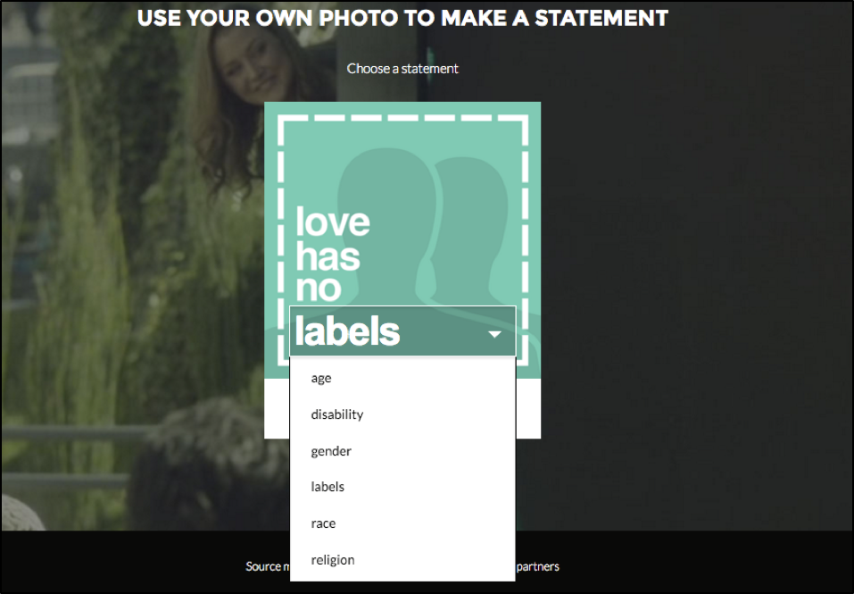
Creating a meaningful movement means making it accessible to everyone. The campaign website featured a photo tool that allowed people to easily join the conversation. With the tool users were able to upload a personal photo and message, then share their interpretation of the campaign with friends on social media.2
4. Successfully managed a diverse range of partners to strengthen the campaign
There’s no one-size fits all model for how partnerships should work. They come in all shapes and sizes. Some partners want to be fully included and receive name recognition, while some just want a small behind-the-scenes role. When designing a campaign with partners its important to explore how partners can contribute on different levels.
This campaign utilized an effective tiered partnership model. The main partners were Upworthy, Ad Council and R/GA. They did most of creative work and organization for the campaign. The next tier included non-profit partners who provided content and expertise for the website. The final tier included big brand supporters (Coca-Cola, P&G, Allstate, State Farm, PepsiCo, Unilever). They contributed their far-reaching social media channels to help spread the campaign’s message.3
How The Campaign Could Further Improve:
The campaign was exceptional at achieving awareness – over 100 million combined views on YouTube and Facebook, and over 1 billion media impressions.7 However, what was the social impact? How successful was the campaign at tackling implicit bias? The campaign’s social impact results could not be found anywhere. The campaign likely achieved a positive social impact, but the lack measurement prevents partners from knowing if the campaign was effective and how to further improve the campaign in the future.
Overall, the campaign is a great case study for anyone looking to tackle a social issue with partners. The only criticism is the lack of social impact measurements. Any campaign aiming to tackle a social issue must ensure social metrics are included - it’s the only way to truly know if it’s a success.
References:
1. http://www.aaaa.org/news/press/Pages/The4AsRevealsWinnersofthe2016PartnerAwards.aspx
2. http://lovehasnolabels.com/
3. https://www.youtube.com/watch?v=PnDgZuGIhHs
4. http://www.adweek.com/news/advertising-branding/ad-day-beautiful-ad-council-psa-reminds-us-were-all-human-underneath-163245
5. https://www.youtube.com/watch?v=XjJQBjWYDTs
6. https://www.youtube.com/watch?v=vUGDQo2Pb6g
7. https://www.youtube.com/watchv=6iHgdYjePE&list=PLEsVTBBqGqte4igVojrcpEEJyXKt35Wz2&index=6


